Book design
Skoftig
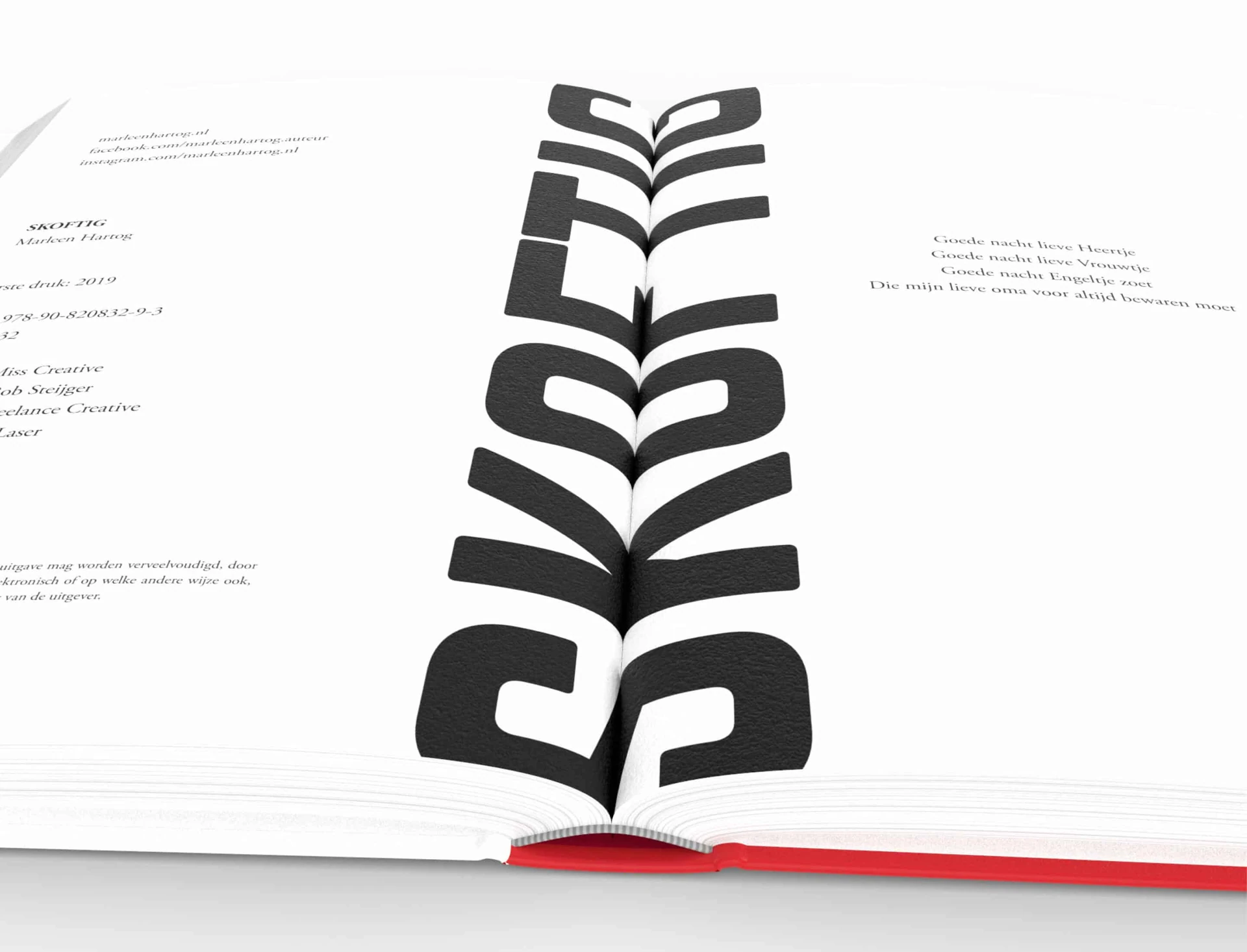
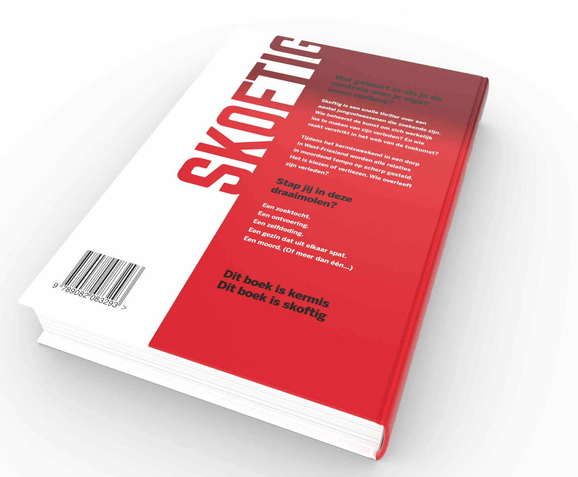
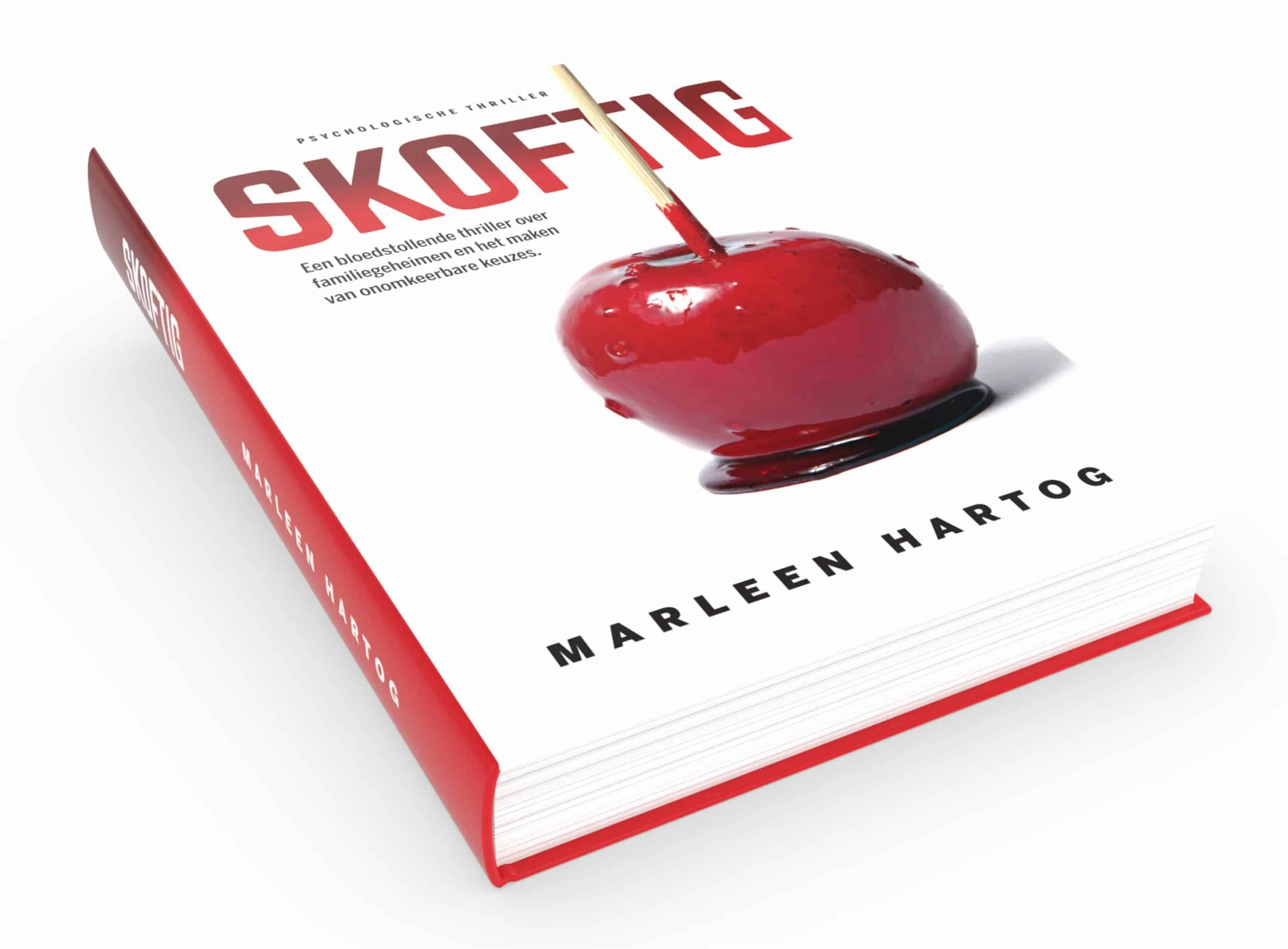
A striking cover for a thriller.
The brief
A striking design for “Skoftig”, together with a visual direction for a series of thrillers.
The solution
I first looked for a metaphor that could make the cover stand out. Part of the story takes place at a fairground. I saw the familiar candy apple as a murdered apple, covered in blood 😉. That became the main visual. The raw character of the story called for a heavy, rough typeface.
Skoftig was published in 2019. That year, the book was shortlisted for “Best Dutch-language Thriller” in the ThrillZone Awards jury prize.