Visual identity
Haaglanden Gezonder
Health in motion.
The brief
For HaaglandenGezonder.nl, I was asked to develop a visual identity for a broad movement promoting healthier lifestyles in the Haaglanden region. It needed to appeal to residents while also working for municipalities, policymakers and healthcare organisations. The identity had to encourage action without lecturing: positive and welcoming, without feeling distant.
The solution
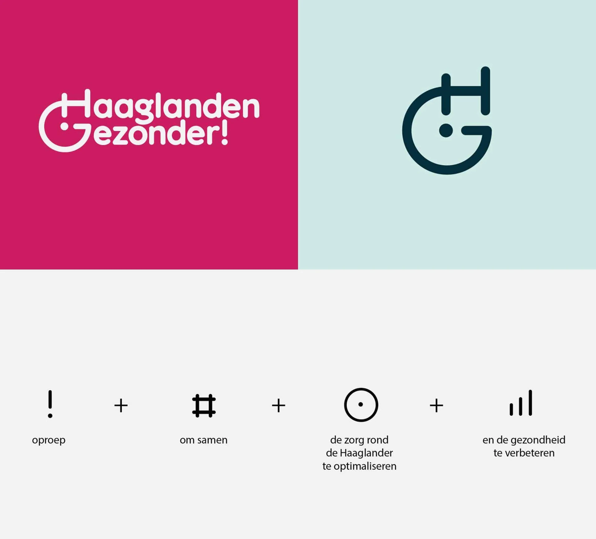
I translated the heart of the initiative — health in motion — into an identity that combines energy and accessibility. The exclamation mark in the logo emphasises urgency and action. Rounded shapes and soft typography give it a friendly, approachable character.
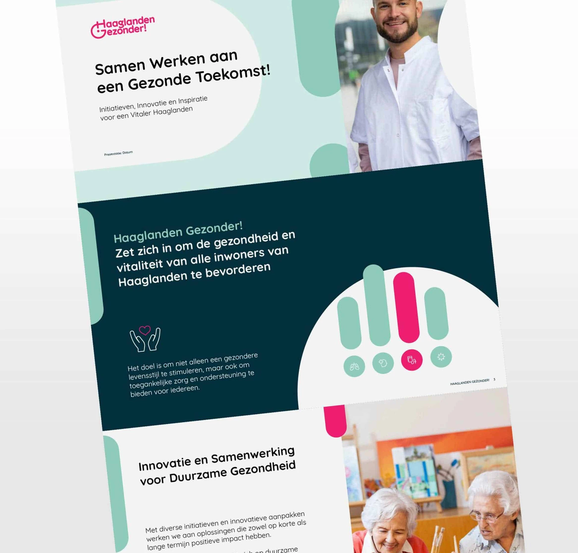
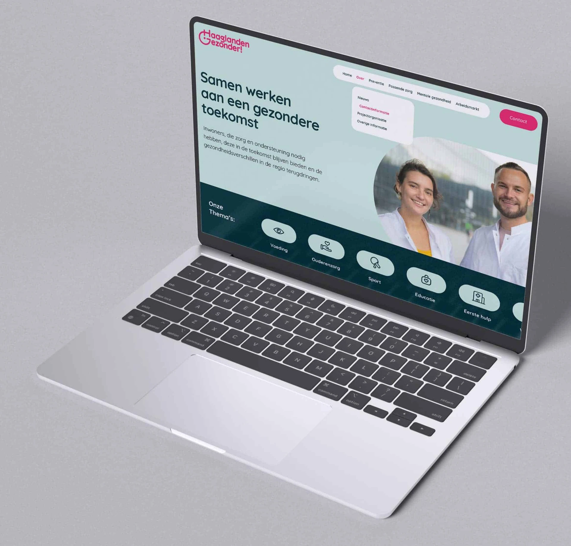
The colour palette combines energising magenta with calming shades such as mint and soft blue, so the identity can both motivate and reassure. A pill shape forms the visual foundation, recurring in icons, buttons and layout elements to create a recognisable thread across all communication.
The result is a versatile regional identity that works across a wide range of applications, from an online platform to local campaigns. A design that speaks to people, encourages action and invites them to take part.