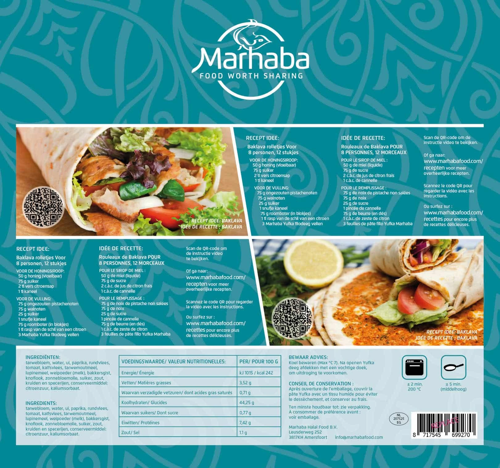
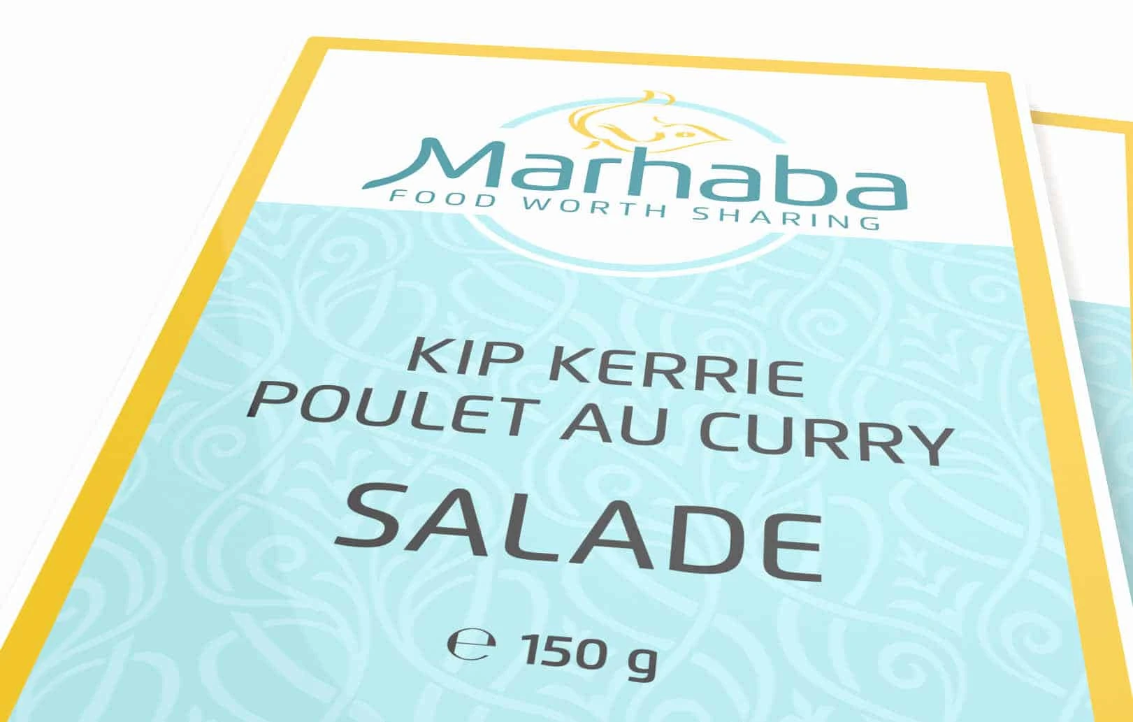
Brand identity & packaging
Marhaba Food
Food worth sharing.
The brief
Redesigning the logo, visual identity and packaging to make the brand more accessible, appealing to both Muslim and non-Muslim consumers.
The solution
I began by exploring the brand and found that a genuine sense of family, combined with good food, was at its heart. This inspired the tagline “Food worth sharing”, linking product quality with the warmth of being together. After all, you share food with friends and family when you’re proud of it.
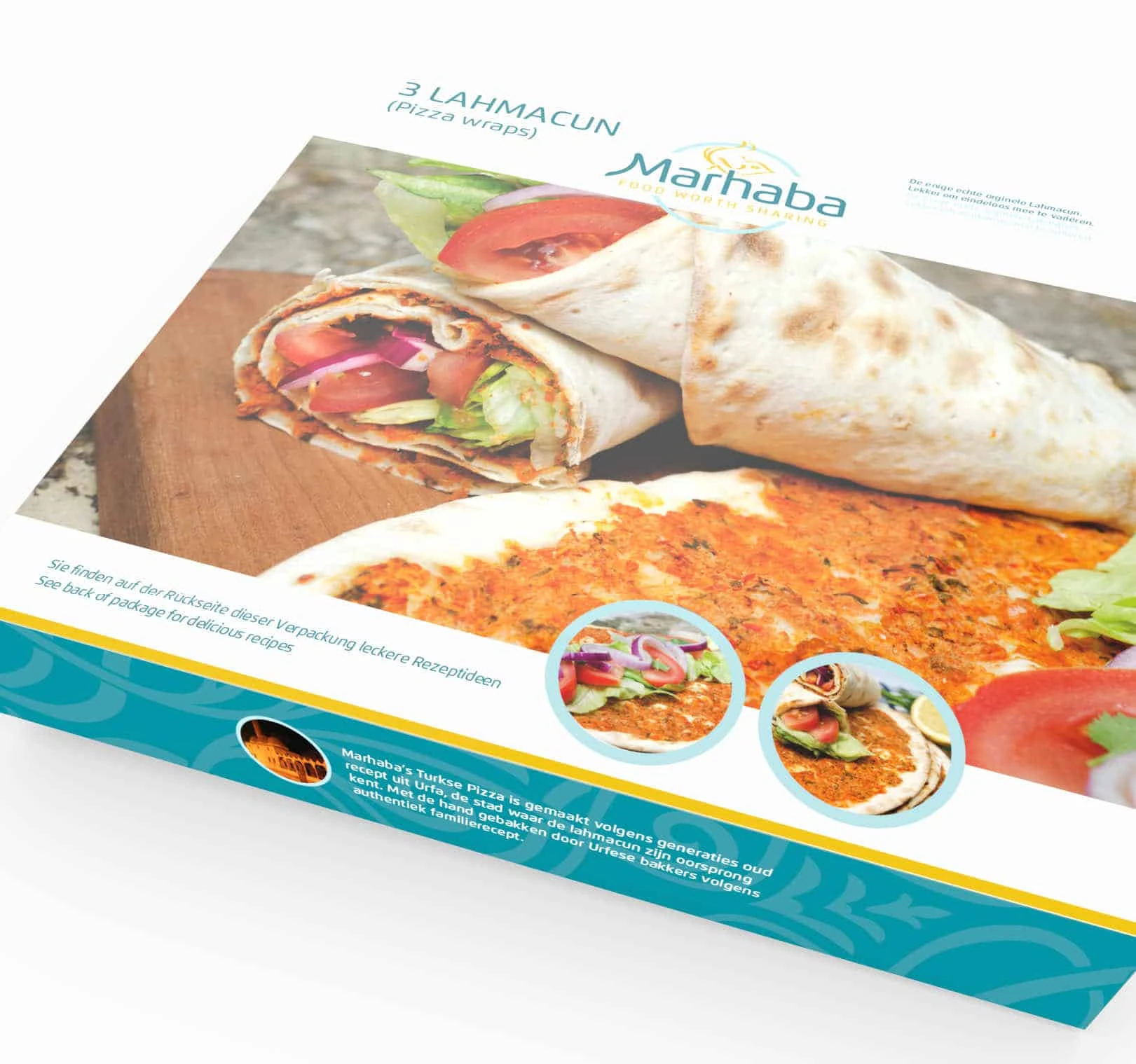
For the visual identity, I chose an accessible colour palette with a Mediterranean feel. A subtle Arabic pattern adds authenticity without taking over.
I also explored different ways to present the halal symbol in an approachable way. Together with the client, I found a way to integrate it naturally. The round base shape reinforces a sense of connection, while the adapted “M” provides a subtle visual cue for recognition.
Since the redesign, Marhaba has gained more shelf space in the halal ranges of Albert Heijn and Jumbo supermarkets.